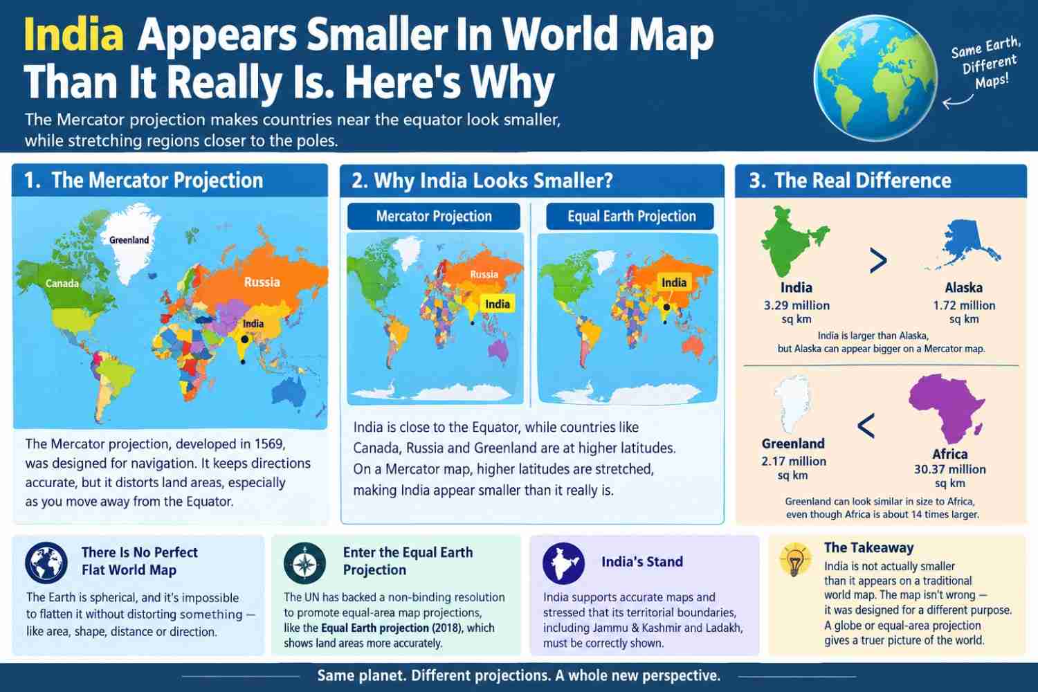
The world map most people have grown up seeing does not accurately represent the actual size of countries. India, despite covering around 3.29 million square kilometres, can appear surprisingly small compared with countries and regions at higher latitudes.
The main reason is the Mercator projection, a type of map projection developed by Flemish cartographer Gerardus Mercator in 1569. It was designed primarily for navigation because it allows sailors to plot constant compass directions as straight lines. However, it comes with a major trade-off: land areas become increasingly distorted as they move away from the Equator.
Why does India look smaller?
India is located relatively close to the Equator compared with countries such as Canada and Russia. On a Mercator map, areas at higher latitudes are stretched, making them appear much larger than their actual size.
This is why Greenland can look comparable in size to Africa on a traditional world map, even though Africa is actually about 14 times larger than Greenland.
The same distortion affects India. On standard Mercator maps, Alaska can appear larger than India, although India has a greater land area. If India were digitally moved toward the North Pole, its apparent size on a Mercator map would increase dramatically.
There is no perfect flat world map
The Earth is spherical, while a conventional world map is flat. It is therefore impossible to flatten the entire planet without distorting at least one aspect—such as area, shape, distance or direction.
Mercator prioritised direction and navigation rather than accurate land-area comparison. That made it extremely useful for sailors, but less suitable for showing the true relative size of countries and continents.
Enter the Equal Earth projection
The debate over map distortion has gained fresh attention after the United Nations General Assembly backed a non-binding resolution promoting equal-area map projections, including the Equal Earth projection. The resolution aims to encourage more accurate representations of the relative size of continents and countries in education, media and technology.
The Equal Earth projection, introduced in 2018, is designed to preserve the relative areas of landmasses much more accurately. Under such maps, Africa and other regions near the Equator appear closer to their true scale.
India also supported the UN resolution, while stressing that maps must accurately represent India's territorial boundaries, including Jammu and Kashmir and Ladakh.
The takeaway
So, India is not actually smaller than it appears on a traditional world map. The apparent difference is largely a consequence of the map projection being used.
A globe provides a much better visual representation of relative land size, while equal-area projections such as Equal Earth offer a more accurate way to compare countries and continents on a flat map.
The map isn't necessarily wrong—it was designed for a different purpose. The important thing is understanding what the map is showing, and what it is distorting.
"The decisions we make today will shape the world for generations to come."